
Creating Column Layouts
Column Size

|
Important A column with no size specified will expand to fill the remaining width in a container. Such columns are known as
implicitly sized columns, see
Fluid Column Resizing later in this section. The Column sizing is applied sequentially as the code is processed, so if there are three columns in a row, and the second column does not have a size value, it will expand to displace the third column onto a new line within the row.
|

|
Note Multiple elements in a single Column are displayed in a vertical stack.
|
code editor
<vdl version="4.6">
<vdl-page>
<vdl-section>
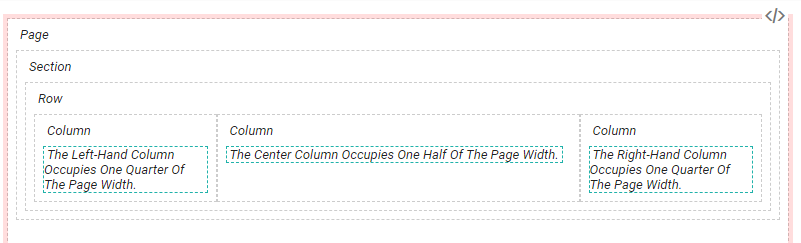
<vdl-column size="3">The left-hand column occupies one quarter of the page width.</vdl-column>
<vdl-column size="6">The Center column occupies one half of the page width.</vdl-column>
<vdl-column size="3">The right-hand column occupies one quarter of the page width</vdl-column>
</vdl-section>
</vdl-page>
</vdl>
View Designer
Use the New View wizard to generate a three-column layout—as good practice, the wizard creates three equally sized columns within a row element (the row element, including the columns, is duplicated—delete the second row).
Configured column widths in View Designer

Rendered column widths
Fluid Column Resizing
- In a fluid section, defined by the tag layout=″fluid″, columns will resize as the browser window resizes, so that a column of size 3 always occupies one quarter (3/12ths) of the browser width.
- In a fixed section, defined by the tag layout=″fixed″, the column widths remain the same when the browser window is resized.
|
|
Note If the total width of all columns adds up to more than 12, the surplus columns will wrap onto the next row and may not display correctly.
|
- if it is the only column in a row it is given a size of 12.
- if it is not the only column, it will be made just big enough to hold the widest contained element
© 2001-2019 Fair Isaac Corporation. All rights reserved. This documentation is the property of Fair Isaac Corporation (“FICO”). Receipt or possession of this documentation does not convey rights to disclose, reproduce, make derivative works, use, or allow others to use it except solely for internal evaluation purposes to determine whether to purchase a license to the software described in this documentation, or as otherwise set forth in a written software license agreement between you and FICO (or a FICO affiliate). Use of this documentation and the software described in it must conform strictly to the foregoing permitted uses, and no other use is permitted.