
Creating a Basic AutoTable
<table id="example1"></table>
var view = insight.getView();
var observer = view.withFirstScenario();
observer
        .bindAutoTable({
            tableId: 'example1',
            columnOptions: [
                {name: 'Array1'}
            ]
        });
view.start();
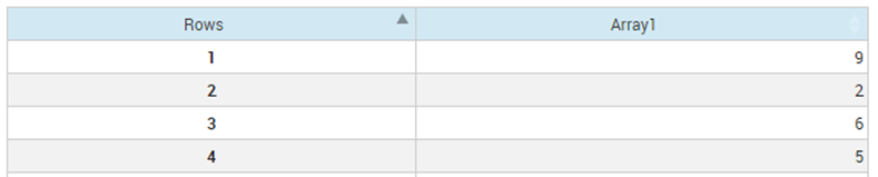
Resulting AutoTable

|
Note The index set
Rows for
Array1 has been included in the resulting table.
|
overrides: {
    bPaginate: true,
    iDisplayLength: 10
}
bPaginate and iDisplayLength are both options that get passed in to the DataTables code. See the http://datatables.net website for details on all the options that are available.
|
|
Note Only arrays with unique index sets can be displayed in an AutoTable. If an array uses the same index set more than once, an error will be logged and the table will not be drawn.
|
Filtering
overrides: {
    bFilter: true
}
columnOptions: [
        {
            name: 'Array1',
            filterByFormatted: true
        }
    ]
In some circumstances, this can make it easier for the user to search for data in the table.
Layout
overrides: {
    bAutoWidth: false,
    aoColumns: [
        {
                sWidth: '20px'
        }
    ]
},

columnOptions: [
        {
            name: 'Array1',
            width: '40px'
        }
    ]
<div style="width: 40px">
    <table id="example1"></table>
</div>
Sorting Data
overrides: {
    aaSorting: [
        [1, 'desc']
    ]
}
|
|
Note By default, the sorting will occur on underlying values. To sort using formatted values, specify
sortByFormatted on the
columnOptions tag.
|
Data Editing
AutoTable can be configured to allow edits to the backing array. For example to make Array1 editable, specify editable in the columnOptions.
|
|
Note A number of options can be used in conjunction with
editable. For example, if dealing with a Boolean type value, an
editorType option can be specified. Then a value can be specified for the checked/unchecked options as shown in the following code fragment:
columnOptions: [
    {
        name: 'Array1',
        editable: true,
        editorType: insight.components.Table.EditorType.CHECKBOX,
        uncheckedValue: 'on',
        checkedValue: 'off'
    }
]
|
Row Addition and Deletion
Where edits are permitted, it is also possible to allow the addition and removal of rows in the table (and therefore the addition and deletion of elements in the underlying arrays). To enable row addition and deletion within an AutoTable specify addRemoveRow: true in the options to create the table. You will also need at least one editable column defined in the columnOptions. This will cause add and delete row buttons to be displayed.
Clicking on an index value in a row will select the row and activate the delete button. A subsequent click on the Delete button will remove the row from the array.
Clicking the Add button will display a form allowing selection of a set of index values for the new row in the array.
insight.getView()
    .withFirstScenario()
    .bindAutoTable({
        tableId: 'table-1',
        columnOptions: [
            {name: 'ArrayEntity', editable: true},
            {name: 'AnotherArray', editable: true}
        ],
        addRemoveRow: 'addrow-autoinc'
    })
    .start();
If the array entities ArrayEntity and AnotherArray are both indexed by a single, integer set then the add row button in the table will create a new set value which will by the current maximum value + 1.
|
|
Note The scenario data is not updated until at least one non-index value is populated for the new row.
|
The row addition and deletion behavior can be customized, and in addition event notification of adding and removing rows is also available. Refer to the JavaScript API reference for more information.
© 2001-2020 Fair Isaac Corporation. All rights reserved. This documentation is the property of Fair Isaac Corporation (“FICO”). Receipt or possession of this documentation does not convey rights to disclose, reproduce, make derivative works, use, or allow others to use it except solely for internal evaluation purposes to determine whether to purchase a license to the software described in this documentation, or as otherwise set forth in a written software license agreement between you and FICO (or a FICO affiliate). Use of this documentation and the software described in it must conform strictly to the foregoing permitted uses, and no other use is permitted.