
Layout Rules
Default settings
As mentioned, the Page element in VDL defaults to a fixed width of 1140 pixels: When a Section, Row, or Column is placed on the artboard, it will adopt the default standard settings that can then be edited in the Attributes pane.
Section Layout
Section (vdl-section) elements default to occupy the full width of the page. When you create multiple Sections within a Page (vdl-page), the Sections will be stacked vertically.A Section will only permit a Row element to be dropped onto it.
Row Layout
Row (vdl-row) elements within Sections occupy the full width of a Section, so multiple Row elements in a Section are stacked vertically. A Row element will only permit a Column element to be dropped onto it. Each Row (vdl-row) is proportionally divided into twelve units, which is relevant when assigning a width to a Column.
Column Layout
Column (vdl-column) elements default to the full width of the parent Row element, so multiple Column elements in a Row are stacked vertically.

|
Important A column with no size specified will expand to fill the remaining width in a container. Such columns are known as
implicitly sized columns, see
Fluid Column Resizing later in this section. The Column sizing is applied sequentially as the code is processed, so if there are three columns in a row, and the second column does not have a size value, it will expand to displace the third column onto a new line within the row.
|

|
Note Multiple elements in a single Column are displayed in a vertical stack.
|
|
|
Note The
Offset attribute on a Column is subtracted from the overall width available in the Column when calculating space on a Row. This means a single row can display without wrapping:
|
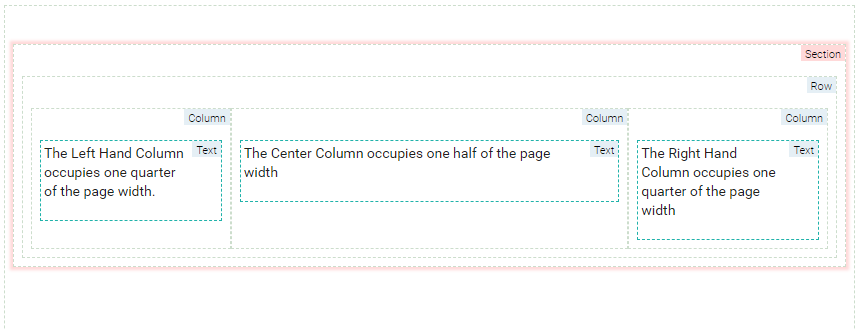
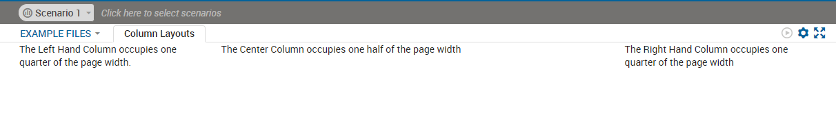
Code editor
<vdl version="4.7">
  <vdl-page>
    <vdl-section>
      <vdl-row>
          <vdl-column size="3">The Left Hand Column occupies one quarter of the page width.</vdl-column>
          <vdl-column size="6">The Center Column occupies one half of the page width</vdl-column>
          <vdl-column size="3">The Right Hand Column occupies one quarter of the page width</vdl-column>
      </vdl-row>
    </vdl-section>
  </vdl-page>
</vdl>
View Designer
Use the New View wizard to generate a three-column layout—as good practice, the wizard creates three equally sized columns within a row element (the row element, including the columns, is duplicated—delete the second row).
Configured column widths in View Designer
Rendered column widths
Fluid Column Resizing
- a Page defaults to a width of 1140px
- a Section defaults to 100% of Page width
- a Row defaults to 100% of Section width
In a Section defined as fluid by the tag layout=″fluid″, columns will resize as the browser window resizes, so that a column of Size 3 always occupies one quarter (3/12ths) of the browser width.
In a Section defined as fixed by the tag layout=″fixed″, the column widths remain the same when the browser window is resized. Each Column will be 1/4 x 1140px = 285px
- if it is the only column in a row it is assigned a size of 12.
- if it is not the only column, it will be made just big enough to hold the widest contained element.
© 2001-2020 Fair Isaac Corporation. All rights reserved. This documentation is the property of Fair Isaac Corporation (“FICO”). Receipt or possession of this documentation does not convey rights to disclose, reproduce, make derivative works, use, or allow others to use it except solely for internal evaluation purposes to determine whether to purchase a license to the software described in this documentation, or as otherwise set forth in a written software license agreement between you and FICO (or a FICO affiliate). Use of this documentation and the software described in it must conform strictly to the foregoing permitted uses, and no other use is permitted.