
Form Layout and Validation

|
Note See
Creating Column Layouts for more on the grid layout used by the
View Designer when creating Views.
|
<vdl version="4.7">
   <vdl-page>
    <vdl-section>
        <vdl-row>
          <vdl-column>
            <vdl-form>
              <vdl-field entity="changeShare" options-set="ShareIds">
              </vdl-field>
              <vdl-field entity="cautionText"></vdl-field>
            </vdl-form>
          </vdl-column>
        </vdl-row>
    </vdl-section>
  </vdl-page>
</vdl>
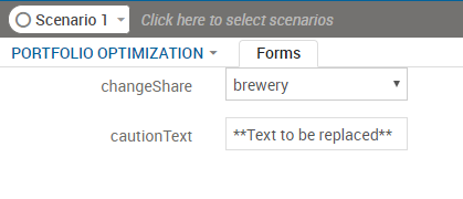
Appearance of the Default Form Layout
This approach is representative of VDL forms as they were up to and including VDL version 2.0.
<vdl version="4.7">
  <vdl-page>
    <vdl-section>
        <vdl-row>
          <vdl-column size="4">
            <vdl-form>
              <vdl-field entity="changeShare" options-set="ShareIds">
              </vdl-field>
              <vdl-field entity="cautionText"></vdl-field>
            </vdl-form>
          </vdl-column>
        </vdl-row>
    </vdl-section>
  </vdl-page>
</vdl>
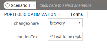
Rendered View of Alternative Form Layout
The layout mode can be changed to vertical, where each field remains on a separate line but the labels appear above the associated input controls. This is accomplished by simply specifying a layout="vertical" attribute on a <vdl-form> element.
A final available option is to use inline inputs, which display the input controls without labels, and float inline with text. This is easy to achieve with the inline attribute of the <vdl-field> element.
Form Field Validation
Invalid Value
© 2001-2020 Fair Isaac Corporation. All rights reserved. This documentation is the property of Fair Isaac Corporation (“FICO”). Receipt or possession of this documentation does not convey rights to disclose, reproduce, make derivative works, use, or allow others to use it except solely for internal evaluation purposes to determine whether to purchase a license to the software described in this documentation, or as otherwise set forth in a written software license agreement between you and FICO (or a FICO affiliate). Use of this documentation and the software described in it must conform strictly to the foregoing permitted uses, and no other use is permitted.