
An AutoForm Example
In many respects AutoForm could be regarded as an expansion upon the AutoText component, binding entities from the scenario data model to editable form elements.
AutoForm works with HTML Forms and Form input elements. Unlike traditional web forms, AutoForm takes advantage of AJAX when updating information back to the server and never involves a traditional HTML Form submission with the corresponding server refresh.

|
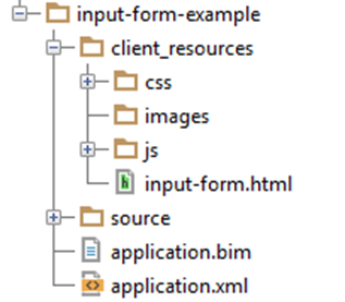
Note The
client_resources folder is a fixed name required by
Xpress Insight so that it can find your view files when loading the app. Also, remember that the name of the main view file
input-form.html needs to be registered in the companion file for it to be available as a view.
|
From now on we will only specify the HTML snippet that you need to add to the base HTML file from the 'Quick Start app rather than the whole HTML file, since much of the base file will be the same for every example.
<!-- input-form.html -->
<form id="input-form-example">
	<input name="SupportLevel" data-entity="SupportLevel" type="text">
	<input name="SupportCosts" data-entity=" SupportCosts " data-indices="1" type="text">
	<input type="radio" name="goal" value="1" data-entity="Goal"/> Maximize Value
	<input type="radio" name="goal" value="2" data-entity="Goal"/> Minimize Cost
	<input type="radio" name="goal" value="3" data-entity="Goal"/> Maximize Efficiency
	<select id="my-integer" data-entity="MyInteger" data-options-set="Jobs">
		<option value="">-- None selected --</option>
	</select>
	<input id="runbutton" type="button" name="run" value="Optimize"/>
</form>
This example shows the HTML markup for constructing the AutoForm. As you will see this is created using basic HTML, much the same as you would use if you were creating an input form for a typical web page. The difference is in the extra data attributes that tell the JavaScript API how to bind to the underlying model, and those entities we want to expose for the purpose of editing.
The first input field SupportLevel uses the data-entity attribute to specify the entity that AutoForm should bind with this input. This means that it will be populated with the data from the SupportLevel entity and any changes made by the user will be persisted back to the entity in the model.
The second input field SupportCosts demonstrates the same type of construct only this time SupportCosts would be an array declaration in the model and the data-indices attribute is used to specify which item by index we wish to edit. In some cases where the array is known to be small, we could have one of these input tags for each index. Where there are a large number of items in the array we would usually recommend an editable AutoTable component, which is explained in a later section.
The next three input fields make up what we refer to as a radio button group that consists of small round buttons, with labels, which can only have one button selected, or none at start if no value is in the target entity. Any of the values (1,2,3) can be selected by the end user and this will then be saved in the Goal entity. The shared name attribute is important in tying the behavior of these three radio buttons together.
After the radio button group, we have a select input field. This usually displays as a button that triggers a drop-down menu when clicked from which the end user can select a value to populate the entity. As usual, data-entity specifies the name of the entity we want to display and edit but the data-options-set attributes names the entity that holds a set used to populate the list of items in the drop-down menu.
We have also specified a single child option tag. This is standard HTML and specifies the message to show if the MyInteger entity is empty.
Finally, we have an input type of button, which does not submit the form as in traditional HTML input forms but is available for us to attach functionality as detailed in the next section.
var view = insight.getView();
var observer = view.withFirstScenario();
observer
  .bindAutoForm({
    formId: 'input-form-example',
    runButton: 'runbutton'
  });
view.start();
- formId: a required property. A String corresponding to the idea of the form we created in the HTML markup.
- runButton: an optional property. A String specifying the id of a HTML button that is wired up by AutoForm for the purpose of providing an in-view control to execute the current scenario.
runButton is optional because the user can always use the respective client to execute scenarios, however, it can provide a more obvious and attractive means for the user to interact with your application. There are a number of other options that can be set in the bindAutoForm options object parameter. Please see the JavaScript reference under Insight.components.AutoForm for more details.
© 2001-2020 Fair Isaac Corporation. All rights reserved. This documentation is the property of Fair Isaac Corporation (“FICO”). Receipt or possession of this documentation does not convey rights to disclose, reproduce, make derivative works, use, or allow others to use it except solely for internal evaluation purposes to determine whether to purchase a license to the software described in this documentation, or as otherwise set forth in a written software license agreement between you and FICO (or a FICO affiliate). Use of this documentation and the software described in it must conform strictly to the foregoing permitted uses, and no other use is permitted.