
View Designer Overview
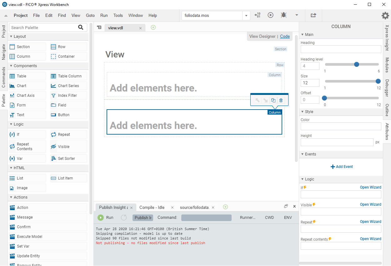
Views for Xpress Insight apps are composed of various elements: Layouts (such as Section, Row, and Column), Components (such as Tables and Charts), and Logical elements (such as Repeat and Visible). Drag elements from the Palette to the artboard to add them to the view.

|
Note Views are regularly automatically saved while they are open in the
View Designer.
|
Hovering over the elements on the artboard will highlight their boundaries. Elements can be selected by a left click.
The most commonly used attributes of the currently selected element are displayed in the Attributes pane; The selected element type is shown at the top of the Attributes pane.
Elements placed on the artboard can be moved relative to each other, duplicated, or deleted by utilizing the action toolbar that displays when a placed element is selected. Elements can also be cut, copied, and pasted.
Editing the View layout
- By adding new layout elements, such as Sections, Columns, and Rows.
- By clicking an element placed on the artboard and dragging it to the new location.
- By using the action toolbar.
The action toolbar is displayed when an element on the artboard is selected. You can also duplicate or delete the element using buttons on this menu. The apparent behavior of the two move buttons depends on the level of the relative items. An element can move within the confines of its parent container—The move buttons are disabled if an element would move outside these confines.
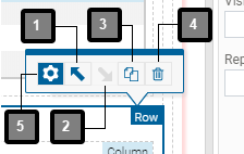
| Item | Description |
|---|---|
| 1 | Move before any preceding adjacent element |
| 2 | Move after any following adjacent element |
| 3 | Create a duplicate immediately after the selected element |
| 4 | Delete the selected element |
| 5 | Open element wizard (re-entrant tool—see note) |
|
|
Note The re-entrant tool will only be displayed when an appropriate element, that contains content that can be generated using a wizard, is selected on the
artboard.
|
Using the Palette
- blue shading indicates a valid position.
- red shading indicates an invalid position and the element will not be accepted at this position.
The five panes in the Palette and the elements they contain are:
| LAYOUT | Section | Block of page content with padding top and bottom |
| Row | Each row is placed under existing content and can hold up to 12 columns | |
| Column | Divides a row into vertical blocks with a configurable width | |
| Container | Defines an area in the view and is used to hold other elements | |
| COMPONENTS | Table | Placeholder for a table of array entities that are defined in its Table Columns |
| Table Column | Defines the array entities that provide the content for a Table | |
| Chart | Placeholder for a chart that displays model entity data or custom data | |
| Chart Series | Set of entity or data information supplied to the Chart element | |
| Index-Filter | Filter an index out of a VDL chart or table | |
| Form | A container for field elements that controls their behavior | |
| Field | Used to enter text or values in a Form | |
| Button | Can be placed anywhere in the view to set a value and run the scenario | |
| Text | Text in the view can be static or updated using expressions | |
| LOGIC | If | Use an expression to control whether an element is displayed |
| Repeat | Loop around each element in an array, set, element in a JS array, or active scenario. | |
| Repeat Contents | Used to repeat a block of content | |
| Visible | Use an expression to control the visibility of an element | |
| Var | Defines a variable name and its value | |
| Set Sorter | Change the way a set is sorted from the default settings. | |
| HTML | List | A container for List Item elements that populate a bulleted list |
| List Item | A container for an item in a list, each list item must be populated with content such as a text component or an html image container | |
| Image | Defines the source and size of an image in the view | |
| ACTIONS | Action | The base action used to call other Actions or Javascript functions |
| Message | Display a message | |
| Confirm | Show a confirmation dialog | |
| Execute Model | Queue the model for execution | |
| Set Var | Set a dynamic variable | |
| Update Entity | Set the value of a model entity | |
| Remove Entity | Delete the value of a model entity | |
| Create Attachment | Create a new attachment | |
| Edit Attachment | Edit a existing attachment | |
| Manage Attachment | Manage an attachment | |
| Edit Attachment Properties | Open a dialog to change the properties of an attachment | |
| Download Attachment | Download an attachment | |
| Upload Attachment | Upload an attachment | |