
Configuring the Chart View
- numerical values (number or range type columns)
- string (categorical) values
Configure the Chart View
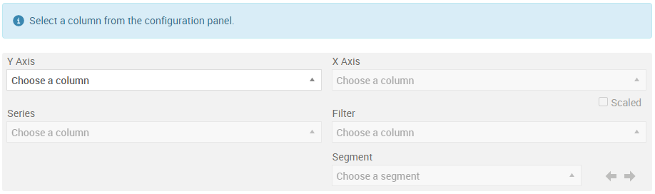
- Select the data to display on the X and Y axis using the drop-down selectors.
- To change your selection, click on the X in the either selector:
- Deselecting the data displayed on the X-axis resets just that selector, and removes any Series or Filter selections.
- Deselecting the data displayed on the Y-axis resets the X and Y axis selectors and removes any Series or Filter selections.

|
Note: Not all lookup model data renders itself to produce a meaningful graph. A meaningful graph depends on the data and the selection of the configuration parameters used to generate the graph.
|
Display the Data by Series
- Click a legend to remove the data from the chart display.
- Double click a legend to display ONLY that data series in the chart display.
|
|
Note: The chart view can display a maximum of 16 ranges.
|
Add a Filter to the Data

|
Tip: For proper segmentation to display on the graph, the inputs you select for this drop-down list should contain duplicate entries.
|
Display Data by Segment
The values in each range can be displayed by selecting the range in the Segment drop down. Use the arrows to the right of the selector to display the next adjacent range. There is also the option to display all ranges.
© 2001-2024 Fair Isaac Corporation. All rights reserved. This documentation is the property of Fair Isaac Corporation (“FICO”). Receipt or possession of this documentation does not convey rights to disclose, reproduce, make derivative works, use, or allow others to use it except solely for internal evaluation purposes to determine whether to purchase a license to the software described in this documentation, or as otherwise set forth in a written software license agreement between you and FICO (or a FICO affiliate). Use of this documentation and the software described in it must conform strictly to the foregoing permitted uses, and no other use is permitted.