
Adding Tooltips
You can also add informatory tooltips to elements in a View through the code editor. Place them inside elements and they are shown when a user hovers over that element.
They can contain an optional title and body content, both of which can be static or dynamic expressions that resolve to text. You can add a tooltip to the input field of the example app by changing the model source:
<vdl-form>
    <vdl-field label="Max investment per share" parameter="MaxPerShare" size="4">
        <vdl-validate pass="=value >= 0">Investment must be zero or greater.</vdl-validate>
    </vdl-field>
    <vdl-field label="Max investment in high risk shares" size="4" parameter="MaxHighRisk">
        <vdl-validate pass="=value <= 200">Max investment per share is limited to 200.</vdl-validate>
    </vdl-field>
</vdl-form>
Insert the snippet within the
vdl-tooltip field tags, shown here before the
validate tags, so the form looks like this:
<vdl-form>
<vdl-field label="Max investment per share" parameter="MaxPerShare" size="4">
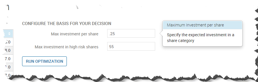
<vdl-tooltip title="Maximum Investment per share" content="Specify the expected investment in a share category"></vdl-tooltip>
<vdl-validate pass="=value >= 0">Investment must be zero or greater.</vdl-validate>
</vdl-field>
<vdl-field label="Max investment in high risk shares" size="4" parameter="MaxHighRisk">
<vdl-tooltip title="Maximum High Risk Investment" content="Specify how much to invest in High Risk Shares"></vdl-tooltip>
<vdl-validate pass="=value <= 200">Max investment per share is limited to 200.</vdl-validate>
</vdl-field>
</vdl-form>
Here, the tooltip titles and content have been set. Republishing the app and hovering the cursor over the input field yields:
Adding Tooltip Help